Graphs:
Bar graphs probably the most versatile way of displaying population data. They are often used to show population growth over time but they can also show things such as the relative proportions of different groups in the society or they may be used to compare populations of different places.
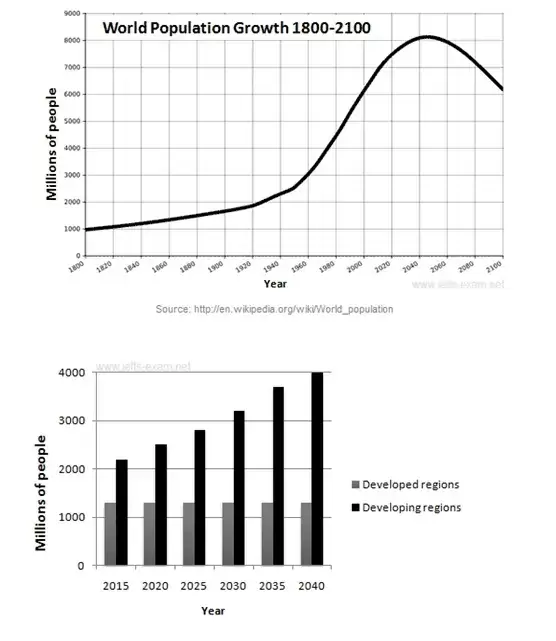
Line graphs are used to show population growth over a period of time. The focus is not so much on the value of each point on the graph but the trend of growth that reflects the overall picture of population increase or decrease.
Pie graphs (or pie charts) are used to compare the relative proportions of groups within a population such as different ethnic groups. The focus is not on the overall population size but how much of this total does each group represent.
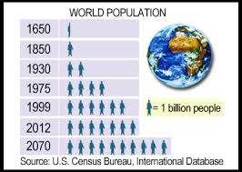
Pictographs use image to show data. They are less boring than the average bar graph as the use of figurines helps the reader to 'humanize' the data being represented. Each 'person' on this graph stands for a certain number.
Maps:
Dot maps are good visuals that show how the population is spaced out or arranged over a geographic area. One dot represents a specific number of people so more dots mean higher population density within an area. Some dot maps use various sizes of dots to represent different concentrations of people - larger dots mean more people within the area shown.
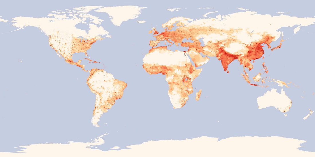
Choropleth maps use shading to display different population densities over an area. Darker shades represent higher concentrations of people within an area. The emphasis here is not actual numbers of people but where people are concentrated.
Population Pyramids:
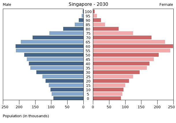
Also called population graphs or age-sex pyramids, These are special types of graphs that show how a specific population is constituted according to sex and age. The horizontal axis shows the population numbers or percentages while the vertical axis shows the age groups within the population. There are actually two graphs lined up side by side sharing the same axes on a population pyramid. To the left is the age breakdown of the male population while to the right there is the age breakdown of the female population. The layout of this special graph makes it easy to assess whether a population is increasing or decreasing; the average age of the population and the proportion of old to young people and males to females.
Examples of choropleth maps, line and bar graphs, pictographs, as well as population pyramids are seen below.
|
|
How to interpret population pyramids.
The general shape of the pyramid tells us some crucial things about a population. Concave or triangle shapes which look closest to a real 'pyramid' are an indication of a high birth rate and possibly a growing population but a also a high death rate. Rectangular shapes show that a population is 'stationary', meaning that birth and death rates may seem to balance out each other. A top heavy or 'upside down' pyramid as seen above indicate a 'constricting' of population growth. There is a low birth rate and high life expectancy due to a low death rate.
Dependency ratio
When analyzing population data it is with an aim of determining a country's needs and coming up with appropriate policies. Calculating a country's dependency ratio is critical to policy makers who have to decide whether to build more schools or hospitals and so on. This ratio is a measure of the proportion of dependent people (aged under 14 and over 65 years) to the productive (or working) population. A low dependency ratio means that there are sufficient productive people to pay for the education and health care of the non-working or dependent population. A high dependency ratio means that there insufficient people to contribute to the care of the non-productive population. It is represented as a percentage. The formula is given below.
% of population under 15 + % of population over 65 X 100
% of people of working age
