When weather data is collected over a period of time such as a month or a year, a map may not always be an appropriate means of presenting such information. Some types of illustrations such as time-lapse satellite imagery and chronological maps may give a good visual of how weather conditions develop over time. However, tables, bar charts/graphs and line graphs are frequently employed by meteorologists and climatologists to summarize and analyze atmospheric conditions over time as well as to make forecasts of future conditions. These illustrations allow us to monitor specific elements of weather and look for patterns, trends and anomalies.
|
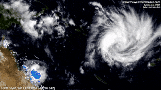
Below: Time-lapse satellite image of a hurricane
|
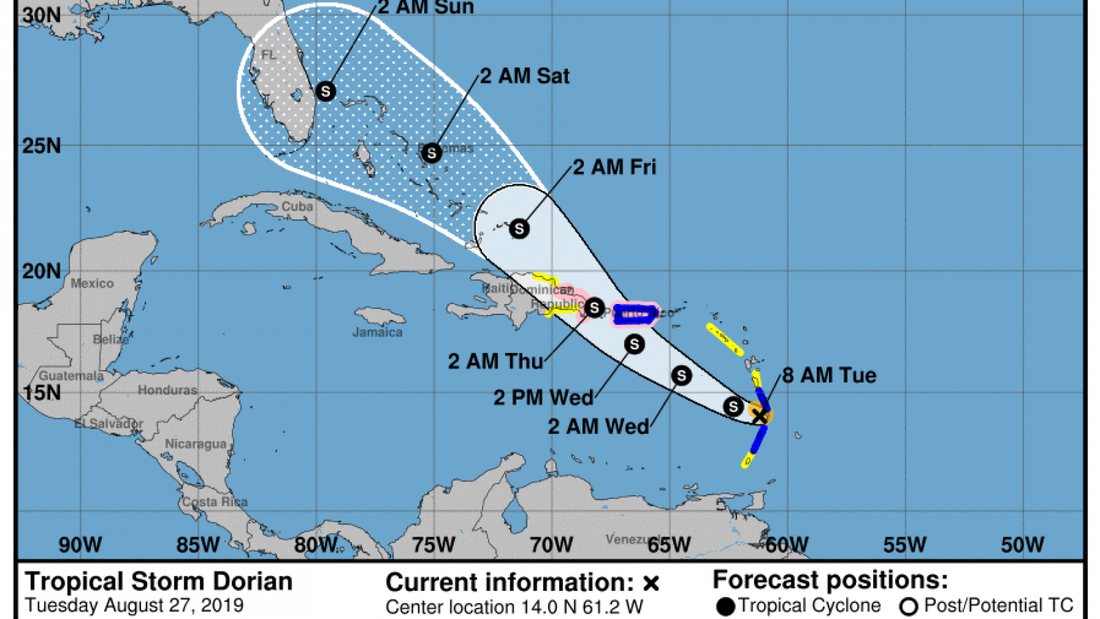
Below: Weather Map showing track and projection of a tropical storm
|
Tables
Tables are used to show specific values for temperature and/or precipitation (rainfall) within a specific geographical area over time. From this data, we can calculate:
Bar Graphs/Charts
Bar graphs in meteorology are most frequently used to map out data about mean rainfall over a time period. Though the values for each day/month may not be as visible to the reader at first glance, they are particularly useful in comparing data within the period covered by the graph. For example we can easily pick out the days/months where mean rainfall peaked or plummeted. Or we can determine at a glance which day/month received twice the amount of average rainfall than another day/month.
Line graphs
Line graphs are used to display both mean temperature and rainfall but are most popularly seen showing mean temperature. Many studies on climate change and global warming are notorious for showing a line graph with projections of soaring temperatures, conveying the image of mercury in a thermometer, rising to the boiling point! Their main strength is showing changes over time. Like bar graphs, the scales on the axes could be adjusted to make even subtle changes seem dramatic, hence their visual impact is much more powerful than a table. However, unlike bar graphs where comparisons among data sets can studied in some detail, the line graph places less emphasis on specific values and focuses more on patterns, anomalies and trends to facilitate forecasting.
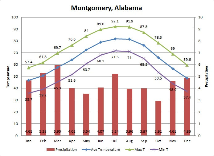
Climographs
Climographs are composite charts which display average precipitation and temperature over a time period of a year. There may be slight variations, however the ones often used for CSEC examinations consist of three axes: The horizontal line or x-axis which is labelled with the months of the year in sequential order from left to right; the right vertical line (or right y-axis) which is populated with the data for average monthly precipitation - bar graphs are drawn to match the values for each specific month's recorded mean rainfall; and the left vertical line (or left y-axis) on which each month's recorded mean temperature plotted then a line is drawn to connect the dots, producing a line or curve. Sometimes, additional data can be included to facilitate deeper analysis such as the Maximum and Minimum temperatures for each month.
Climographs are most useful in showing an area's basic climate at a glance. Inferences can be made about the location of a place given its variation (or lack thereof) in mean monthly temperatures and precipitation. For example, equatorial climates tend to have high mean precipitation throughout the year and very little change in temperatures, while desert areas may have very little rainfall for most of the year.
Tables are used to show specific values for temperature and/or precipitation (rainfall) within a specific geographical area over time. From this data, we can calculate:
- Maximum temperature/precipitation over the period (the highest value)
- Minimum temperature/precipitation over the period (the lowest value)
- The temperature/precipitation range over the period (the difference between the highest and lowest values)
- The total precipitation (in mm or inches) over the period (the sum of ALL the days/months of precipitation)
- The average/mean temperature/precipitation over the period (the sum of all the days/months divided by the number of days/months)
- The median temperature/precipitation (the middle number in the table after sorting the values in numerical order from the smallest to the highest value)
- The mode temperature/precipitation (the value that occurs most frequently in the table)
Bar Graphs/Charts
Bar graphs in meteorology are most frequently used to map out data about mean rainfall over a time period. Though the values for each day/month may not be as visible to the reader at first glance, they are particularly useful in comparing data within the period covered by the graph. For example we can easily pick out the days/months where mean rainfall peaked or plummeted. Or we can determine at a glance which day/month received twice the amount of average rainfall than another day/month.
Line graphs
Line graphs are used to display both mean temperature and rainfall but are most popularly seen showing mean temperature. Many studies on climate change and global warming are notorious for showing a line graph with projections of soaring temperatures, conveying the image of mercury in a thermometer, rising to the boiling point! Their main strength is showing changes over time. Like bar graphs, the scales on the axes could be adjusted to make even subtle changes seem dramatic, hence their visual impact is much more powerful than a table. However, unlike bar graphs where comparisons among data sets can studied in some detail, the line graph places less emphasis on specific values and focuses more on patterns, anomalies and trends to facilitate forecasting.
Climographs
Climographs are composite charts which display average precipitation and temperature over a time period of a year. There may be slight variations, however the ones often used for CSEC examinations consist of three axes: The horizontal line or x-axis which is labelled with the months of the year in sequential order from left to right; the right vertical line (or right y-axis) which is populated with the data for average monthly precipitation - bar graphs are drawn to match the values for each specific month's recorded mean rainfall; and the left vertical line (or left y-axis) on which each month's recorded mean temperature plotted then a line is drawn to connect the dots, producing a line or curve. Sometimes, additional data can be included to facilitate deeper analysis such as the Maximum and Minimum temperatures for each month.
Climographs are most useful in showing an area's basic climate at a glance. Inferences can be made about the location of a place given its variation (or lack thereof) in mean monthly temperatures and precipitation. For example, equatorial climates tend to have high mean precipitation throughout the year and very little change in temperatures, while desert areas may have very little rainfall for most of the year.
Below: Climograph for Montgomery, Alabama (USA)
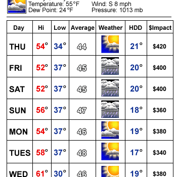
Task 1 : For practice, work out the following for the table above:
Task 2: For practice, answer the following questions based on the information given in the climograph for Montgomery, Alabama.
- The maximum temperature recorded for the period.
- The minimum temperature recorded for the period..
- The average temperature for the period covered in the table.
- The temperature range for Friday.
Task 2: For practice, answer the following questions based on the information given in the climograph for Montgomery, Alabama.
- What is the range of temperature during the period?
- Which month recorded the highest temperature?
- Which month recorded the highest precipitation?
- Which month recorded the lowest rainfall?
- The hottest months are also the wettest months. True or False?
